An easy guide to visual identity – Logo, colours, fonts for Horizon Europe project
17th September 2024 at 1:52 pm
Visual Identity: What is it, and why does it matter?
Visual identity refers to the visual elements that represent your project and make it easily recognisable. These elements include the logo, colour palette, fonts and any other graphic elements used consistently in materials. A well-implemented visual identity effectively conveys key messages across digital, print and physical spaces. It ensures that all communication and dissemination materials, from presentation and deliverable templates to the project website and scientific posters, maintain a unified look and feel, making your project memorable and professional.

Although establishing a distinct visual identity as part of a unified communication strategy offers significant advantages for an EU-funded project, it can be a burdensome task for researchers focused on scientific work, particularly during the stressful proposal-writing phase. In this blog, we leverage our extensive experience as a communication and dissemination partner in numerous EU projects to present an easy three-step guide to kickstarting the creation of a visual identity for your Horizon Europe project.
Step 1: Logo
The first step in developing your EU-funded project’s visual identity is to create its logo. The logo is a central element of visual identity that will immediately represent your project, and it is one of the first things people will notice about your project.
For your logo to be effective, it must clearly reflect your project’s purpose and resonate with your target audience. Begin creating your logo by reflecting on your project’s goals: What does it aim to achieve? Who are the stakeholders? What impact will your project have? A brainstorming session with your team will bring out their creativity. Do not hesitate to research relevant keywords online for inspiration when designing your logo.
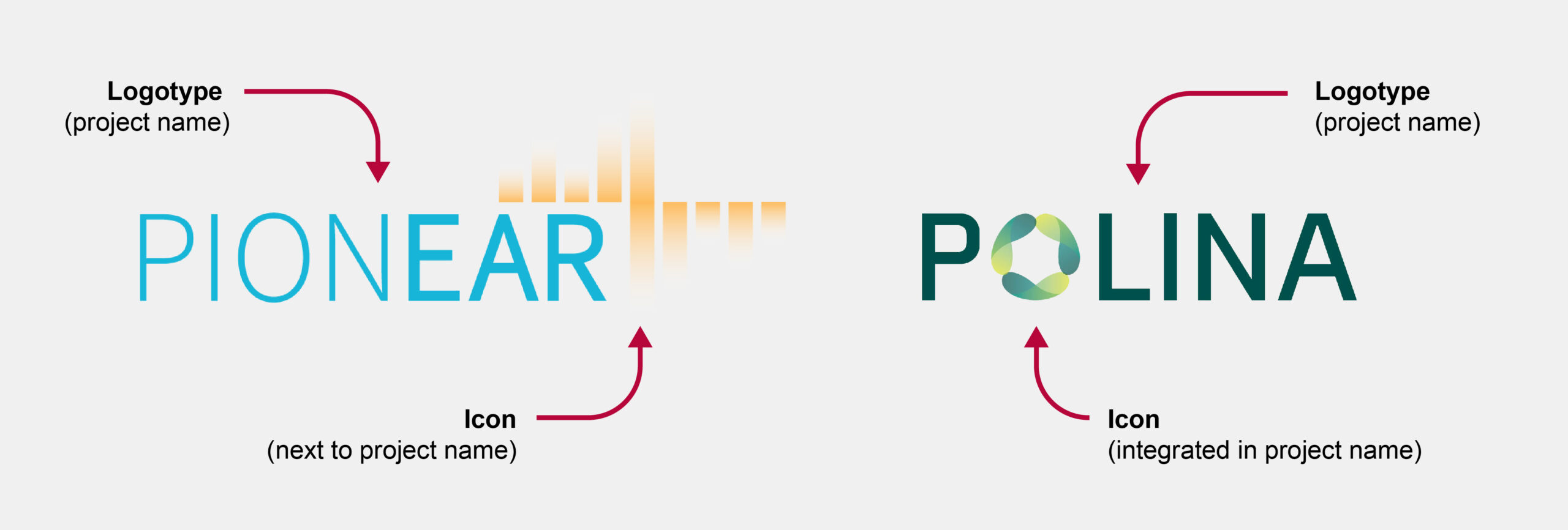
Logo structure: A logo can take many forms, from abstract symbols to representations of objects. A common approach is to combine a project name (a logotype) with a decorative graphic element (an icon). The figure below illustrates how accelopment’s communication experts use two main logo configurations when creating logos for our partner projects. One has the icon placed next to the logotype (as in the PIONEAR project), and the other has the icon integrated into the logotype itself (as in the POLINA project). If you choose the latter, make sure that the letter is still recognisable and that the logotype is readable. Functionality is always more important than aesthetics.

Having a logotype and icon combination gives you the flexibility to use a full logo where space allows and only use an icon, also known as a favicon, if space is tight – as a website favicon or social media page.

Logo design tools: There are many free online tools that you can use to help you create your project’s logo. Here are three examples of such free tools:
- Adobe Express Logo Maker: the name speaks for itself. This app provides express logo creation. It takes a few minutes to follow a five-step setup process in which you select your preferred style and enter your project name before obtaining a ready-to-use logo. Once the logo is generated, you can adapt its colours and fonts. If you need more options, you can switch to Adobe Express for further editing. With a free account, you can download your logo in PNG format.
- Canva: famous and beloved by many, Canva is an easy-to-use graphic design tool that also allows you to create logos. Instead of asking for your preferred style and project name, this platform presents you with a variety of premade logo templates to choose from right away. You can customise a selected logo using a drag-and-drop editing panel. Logo design and download in PNG and JPEG formats are available for free, but beware of many premium templates and graphics elements – these require a subscription.
- VistaPrint: this tool offers a guided logo creation experience similar to that of Adobe Express, but the former generates a wider range of logo proposals to choose from. With a free account, you can download the logo in PNG format and, unusually for a free application, vector SVG format. Vector formats are fully scalable and editable, allowing you to print your logo in large formats without any loss of quality. Additionally, the SVG format enables full customisation, meaning you can further edit your logo using vector graphics software such as Adobe Illustrator.
These three options are good logo design solutions for beginners, though they offer limited editing options and output formats. If you are aiming for a customised logo design that truly represents your vision, you may want to consider involving a professional designer. At accelopment, our team of designers creates custom logo designs for our project partners, tailored to their unique ideas and specific preferences.
Our advice: While creating a logo, remember that it must be versatile and look good in various formats: big or small, vertical or horizontal, colourful or greyscale. Always keep this in mind and avoid long lines of small text or complicated text ornaments. Readability is key!
Step 2: Colour palette
Well-chosen colours can communicate the essence of your project at a glance. While there are no strict rules for selecting the colours for your EU project, certain colours are often associated with specific themes: yellow for energy, green for environmental sustainability, and blue and grey for technology.
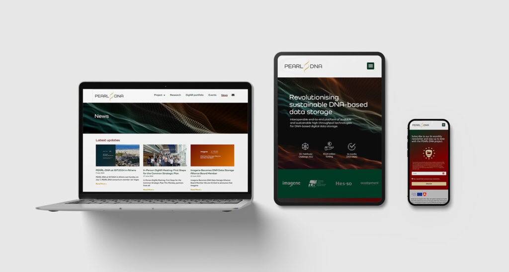
When selecting colours, always consider how they will be used in future communication materials, such as posters, presentations and flyers. The colour palette should be functional, harmonious and adaptable for use across contexts, including websites, social media and print materials. The example below shows how accelopment applied project colours in the flyer design for the PEARL-DNA partner project.

There are many applications that help generate colour schemes, select exact colour shades, and note the colour codes. First, if you used a logo generator like Canva and are happy with the colours proposed, you can take their colour codes (CMYK code for print and RGB code for digital use). If you would like further inspiration, you can check out Coolors or Color Easily.
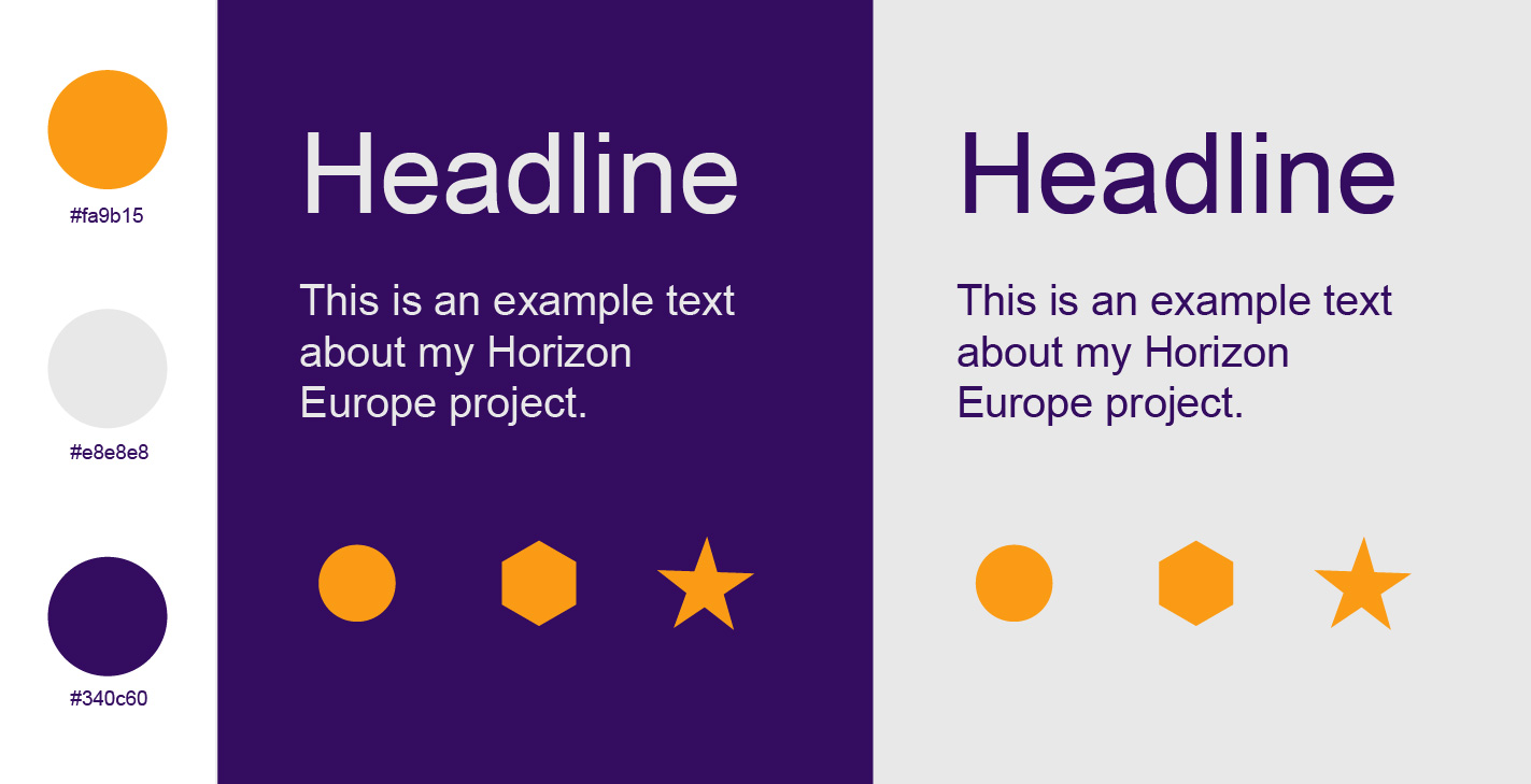
Our advice: Three colours are enough to create communication and dissemination materials that stand out. Start your colour palette with a simple set of three colours:
- One dark colour
- One light colour
- One accent colour
These colours can be combined to create various designs, as shown above. Choose colours with high contrast to make sure all elements are clearly visible, regardless of the combination of colours. This online tool will help you check the contrast between your selected colours. Once you have your three base colours, you can add additional colours to your palette if you would like to.

Step 3: Fonts
Selecting the typography for your project (i.e., choosing fonts for the headings and body text) is another way to maintain consistency in your communication. The font does need not always be highly original, but it should be functional and used consistently across all materials. When attempting to select the right font, consider three main criteria: style, readability and licensing.
Style: Like your logotype, the font you choose for your communication materials should reflect the nature of your project. For high-tech projects, sans-serif fonts (those without small lines or ‘feet’ at the ends of letters, such as Arial) are often used to create a modern, clean and innovative look. In contrast, serif fonts (those with small lines or ‘feet’ at the ends of letters, such as Times New Roman) are typically associated with tradition and academic projects. Ultimately, choosing the right typography is a matter of personal preference, but your choice should align with the tone and message you want to communicate.

Readability: We already mentioned that a successful logotype must be readable, but here is a visual example for the sake of clarity. The same text, ‘My Horizon Europe Project’, is written in two fonts. The large-scale text is readable for both fonts, but what about a smaller scale?

Our advice: Choose standard, preinstalled fonts for your project. If you select a font that is not installed on your Windows or macOS computer, you will need to download and install the associated font file. While this process typically takes only a few clicks, remember that everyone else working on communication and dissemination materials as well as documents such as deliverable reports for your project will also need to install the font.
Implementing your visual identity
While neither a visual identity nor a project logo is a formal requirement, they are generally expected because their inclusion has become standard practice. Today, the majority of submitted proposals already include a logo, with others typically having one created for them when the project starts.
Having a defined visual identity at the proposal stage helps your project stand out. In addition to a prominent logo on the frontpage, you can apply your colours and fonts to elements such as a PERT diagram, GANTT chart, and other figures. Later, when the project is funded and running, this visual identity will be used across various materials, including your project website, PowerPoint and Word templates, posters, factsheets and any other dissemination and communication methods.
Our advice: Defining a visual identity should simplify, not complicate, the creation of communication and dissemination materials. To encourage project partners to adopt it, provide them with a clear, user-friendly visual identity guide. A one-page guide and pre-designed document templates are often invaluable in ensuring consistency and ease of use.
accelopment expertise
The steps outlined in this blog are only the basics of creating a visual identity for your EU project. There are many other factors to consider, including icons, imagery, colour theory, font hierarchy and accessibility, all of which contribute to a complete visual identity. The accelopment dissemination and communication team can support you regarding every aspect of creating and implementing your project’s visual identity. Contact us for expert guidance.

Joanna Plesniak
Project Manager Communications, Group Lead
