Website accessibility – a priority for EU-funded research and innovation projects
23rd March 2022 at 9:48 am
Websites are a central tool in EU-funded research and innovation projects, yet website accessibility is far from being a focus. While there have been over 25,000 funded projects under the H2020 programme alone, each with its legally obliged project website, many project websites are not set up by professional web agencies and designers, and so accessibility is often overlooked.
Could you conceive a world without the Internet? For most, the answer is no. Online the world is at our fingertips; we can browse to our heart’s content, read the latest research project news, watch the newest video creation, or connect with our project partners. And sometimes in our privileged routine, we fail to remember how we use our fingers to click, our eyes to watch, our ears to hear.
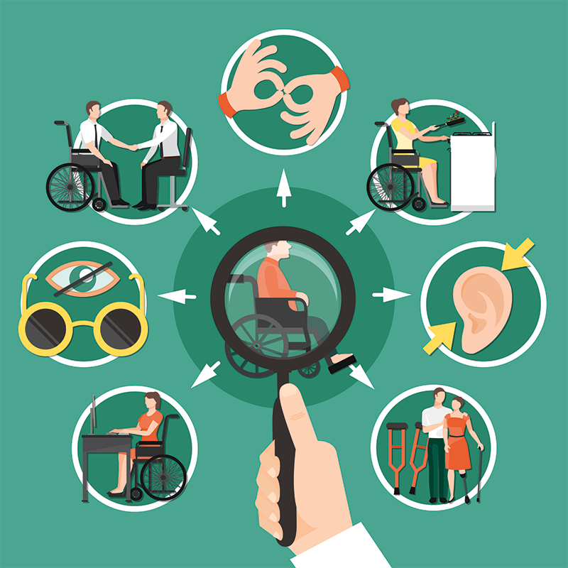
Over one billion people, or 15% of the world’s population, experience some form of disability, ranging from auditory, cognitive, neurological, physical, speech, or visual impairment. In many cases, these impairments hinder the online experience, from videos that are impossible to understand without closed captions or links that are unclickable unless you use a mouse.
In website accessibility, we focus on creating websites that are easy to navigate, where the HTML does not hinder the use of software that reads a website aloud, where colour does not get in the way of the message and where images are appropriately described in alternative text. By focusing on website accessibility, all people will be able to perceive, understand, navigate, and interact with the Web, as well as contribute to it, regardless of their ability.
“The power of the web is in its universality.
Access by everyone regardless of disability is an essential aspect,” said Tim Berners-Lee, inventor of the World Wide Web. Although website accessibility was a core principle in the use and development of the Internet, with the Web Accessibility Initiative conceived already in 1996, most websites are far from being accessible to everyone.
In an effort to battle this shortcoming, the European Union launched its Web Accessibility Directive in 2016, urging all EU institutions to follow international guidelines for accessible web content for their official websites. This would include making text, images, forms, and sounds accessible and comprehensible by as many people as possible without discrimination. Furthermore, feedback mechanisms would need to be in place, so users may flag any accessibility issues. Although for now, this directive is only a strong recommendation, the directive is expected to be revised in June 2022 and may then come as a compulsory requirement.


People with different ability levels access websites in different ways and with different tools. To name a few, those with visual impairments of varying levels may make use of screen readers that read aloud a website’s content, use screen magnifiers or braille keyboards that map out a website’s information through its range of keys. Others with physical disabilities can make use of sip and puff systems, where the cursor moves through inhaling and exhaling on a straw, a variety of hands-free mouse tracking systems with head movements or eye-movement detection, or through voice control. Those with learning disabilities benefit from focus timers (such as Pomodoro methods), text customizers, or text adjusters. Considering this wide range of tools, it is imperative that we focus on creating websites compatible with them or at least minimise unnecessary add-ons that hinder the use of such tools if we want our projects to reach out to as wide an audience as possible.
Making project websites more accessible
Website content can be made accessible in many different ways: from making content perceivable to the senses (sight, hearing and touch), to making content understandable to all users taking into account language and reading levels, or robust for content to be interpreted by a wide variety of assistive technologies. Below, we have compiled tips that are easy to implement in project websites but would be an incredible improvement for people with accessibility needs.
1. Including proper alt text for images


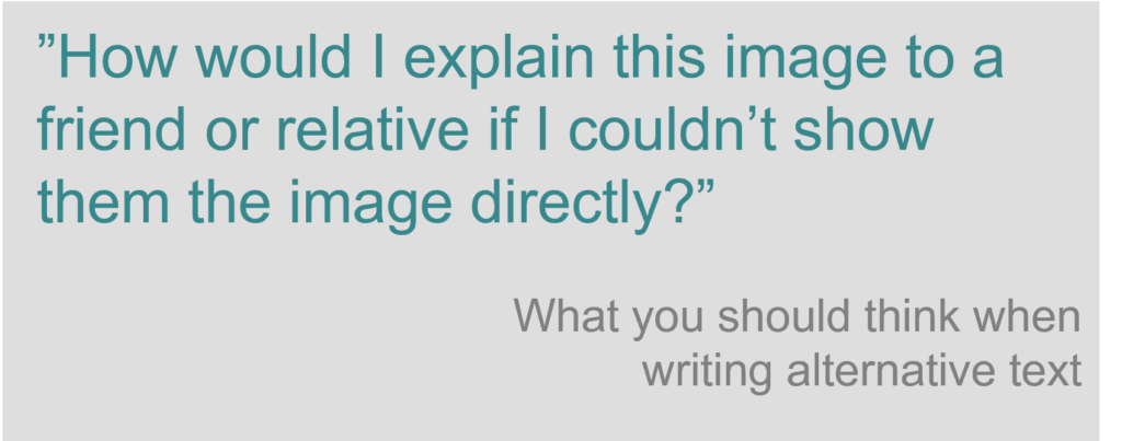
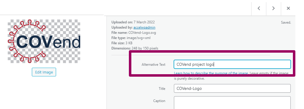
Alt text, or alternative text, are text alternatives that convey the purpose of an image, including pictures, charts, or illustrations. These are used by people who do not see these images; for example, people who are blind and use screen readers will hear the alt text read out. Alt text can be included in all websites, and it usually appears as an additional field in the image upload functionality of your website. This text should contain the same message you wish to convey through that image.
If the image has complex information (such as charts or infographics), the alt text should identify the image first and then provide a detailed description of the information. However, if the image is purely for decoration, such as a background picture, the alt text field can be left empty. Although alt text is not visible on the website (sometimes it may be seen when scrolling over the picture in question), it appears in the website’s markup and is thus read by screen readers.
2. Use colour with care
The most common form of colour deficiency is that of red-green colour. Only using such colours will prevent these individuals from understanding your message, particularly to indicate required fields in a form, as is usually done. Nevertheless, other groups with disabilities, such as users with learning disabilities, benefit greatly from colour when used to distinguish and organise your content. To satisfy both, try using colour combined with other visual indicators. For example, in addition to mark a required field in a form in red, put an asterisk as well.
For your website’s design, focus on colour contrast rather than on the variety of colour. Some people have trouble distinguishing colours with similar saturation. It is better to use tints and tones of a pure colour to distinguish lines or bars in graphs. Furthermore, separating blocks of content using visual separations, such as whitespace, or borders, makes for a better-defined structure and improves readability. Finally, you should use evaluation tools that can automatically detect any contrast issues and make improvement recommendations.
3. Use headings correctly
Often, websites have sections of information separated by visual headings, such as the ones in this blog post. The top heading is larger and in bold, whereas the following ones are smaller or have a less prominent typography. Websites categorise these headers, the top being Heading Level 1 <h1>, followed by Level 2 <h2>, Level 3 <3>, etc. Make sure to follow this meaningful hierarchy and do not skip heading levels so people who can only use the keyboard or use screen readers can easily navigate through the headings. For example, skipping levels from <h1> to <h3> because it fits your design better will make screen reader users wonder where section <h2> went.
4. Give links unique and descriptive names
Giving links descriptions such as “click here” is not considered descriptive enough and will prove ineffective for screen readers. For example, if you are pointing your visitors to a page called “About us”:
- Try not to say: “Click here to read about our project.”
- Instead, say: “To learn more about our project, read about us.”
Taking your EU project websites to the next level
Following these tips will make your website’s content accessible to a wider range of people with disabilities and will often make your content more usable to users in general as well. In addition to making websites accessible it is crucial to maintaining them as well. A good way to approach this would be through the EU’s recommendation of creating feedback channels, while another could be to include experts in accessibility or people with disabilities that can test your sites.
We believe that EU-funded research and innovation projects are relevant to the public and should be accessible to all. From Proposal Writing to Communication and Dissemination, our dedicated team pays attention to follow the EU’s guidelines and to take the different ability levels of stakeholders into account throughout the project. In addition, we raise awareness on website accessibility as one of the topics included in our science communication training module for early career researchers. Would you like to make accessibility a priority in your next project? Contact our experts for more information.

Joanna Plesniak
Project Manager Communications
References and resources
- European Commission, Accessibility Overview, https://wikis.ec.europa.eu/display/WEBGUIDE/01.+Accessibility+overview
- W3C, Web Content Accessibility Guidelines, 2008: https://www.w3.org/TR/WCAG20/
- European Commission, Union of Equality: Strategy for the Rights of Persons with Disabilities 2021-2030, 2021: https://ec.europa.eu/social/main.jsp?catId=1484
- European Commission, Shaping Europe’s digital future: Web Accessibility, 2022: https://digital-strategy.ec.europa.eu/en/policies/web-accessibility
- UC Berkeley, Tools for web accessibility evaluation: https://webaccess.berkeley.edu/evaluating/self-assessment/tools
- The World Bank, Disability Inclusion, 2021: https://www.worldbank.org/en/topic/disability#1
- W3C, Web Accessibility Initiative Early Days, 2009: https://www.w3.org/WAI/history#:~:text=Web%20Accessibility%20as%20a%20W3C,(i.e.%20official%20press%20release)
