
From data to insight: The power of data visualisation in EU-funded projects
20th February 2024 at 2:23 pm
Data visualisation has become an essential tool for researchers in EU-funded projects. With the vast amounts of data being collected and analysed, visualisation offers a powerful way to make data accessible and communicate findings in a clear and understandable manner. From a simple chart to a complex infographic – you may want to translate your data into a visual context to explain it to your fellow researchers within and outside of your study area. But to communicate effectively, everyone in the room must speak the same language. In this blog post, we will delve into some data visualisation tools that go beyond a popular MS Excel, allowing the translation of complex data into comprehensive and visually appealing charts.
Understanding your data – understanding your visualisation
As EU-funded research becomes increasingly data-driven, the importance of data visualisation for researchers cannot be overstated. In EU-funded projects, researchers are required to communicate their findings to various stakeholders. However, the technical language and statistical jargon used in research can be complex and difficult for non-experts to understand. This is where data visualisation comes in handy.
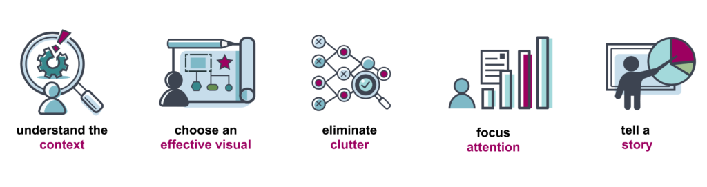
By presenting data visually, researchers can communicate their findings in a simple and accessible manner, making it easier for non-experts to understand the research. This not only helps in effective communication but also increases the impact and reach of the research. As data can be expressed in different forms, charts are a common way of expressing data, as they depict different data varieties and allow data comparison. But before turning raw data into insights, it is crucial to consider the main message you want to convey with it. It is essential that you effectively convey a message and communicate your data, creating engaging data storytelling for your readers. Online resources like Data Viz Project and The Data Visualisation Catalogue can aid in finding suitable references and choosing the appropriate type of chart to represent your data. Below are examples of various charts and their use cases.

Data visualisation tools
There is a wide range of data visualisation tools available. In our blog post, we will focus on some popular code-free instruments.
Flourish is a powerful and user-friendly data visualisation tool with a user-friendly interface that allows users to easily create professional-looking visualisations without any prior coding knowledge. One of the key strengths of Flourish is its variety of visualisation options. This includes traditional charts such as bar charts, line charts, and pie charts, as well as more advanced options like heatmaps, scatter plots, and Sankey diagrams. In addition, Flourish also offers interactive data stories, which allow researchers to present their data in a storytelling format. To cater to the needs of different users, Flourish offers a free plan for personal use and affordable pricing options (as of February 2024) for advanced features. Another advantage of Flourish is its ability to embed visualisations in websites using HTML format. Apart from our accelopment blog posts, we actively use visualisations made in Flourish on our projects’ websites, like COVend and AI-Mind. Flourish also allows users to customise their visualisations by changing colours, fonts, and other design elements to match their preferences or branding. However, it is important to keep in mind that Flourish primarily works with previously structured data. This means that users may face limitations when trying to import unstructured data.
iNZight is a free, open-source software that can be used on any operating system (Windows, Mac OS, Linux, etc.). Its diverse range of visualisation options, including scatter plots, box plots, histograms, maps, and time series plots, allows for an in-depth analysis of data. Additionally, iNZight is integrated with the statistical software R, providing users with the ability to perform statistical analysis and create models within the same platform. The software also offers customisation options, allowing users to personalise their visualisations in terms of colour, size, and labels. However, iNZight may not be suitable for users who require more sophisticated designs and may have limited features compared to other data visualisation tools. Additionally, it is optimised for small to medium-sized datasets, which may result in slower performance and longer loading times when working with larger datasets. But despite some limitations, iNZight is a valuable tool for anyone looking to gain insights from their data.
Adobe Illustrator (AI) is a popular software used for creating vector graphics, illustrations, and overall graphic design. In recent years, it has also been increasingly used for data visualisation, with its ability to create charts and graphs by importing a dataset or manually entering it in the datasheet module. One of the biggest advantages of using AI for data visualisation is that it produces high-quality and professional-looking graphics. With its vector-based graphics, the charts created in AI can be easily resized without losing quality resulting in a polished and professional format for printing. It provides users with a wide range of tools and options to customise their graphs. Whether it is adjusting colours, fonts, or layout, the possibilities are endless with AI. Additionally, it offers a wide range of chart types (column, bar, line, pie, area, scatter and radar graphs) and styles, with tools and features that are easy to navigate. AI integrates seamlessly with other Adobe products, such as Photoshop and InDesign. This allows users to incorporate their charts into other design projects, such as reports, presentations, and infographics. There are lots of (video) tutorials that make it relatively easy to learn and use the tool. However, one of the main drawbacks of using AI just for data visualisation is its price. While it does offer a free trial, this subscription-based software as a part of the Adobe Creative Suite can be costly for some users.
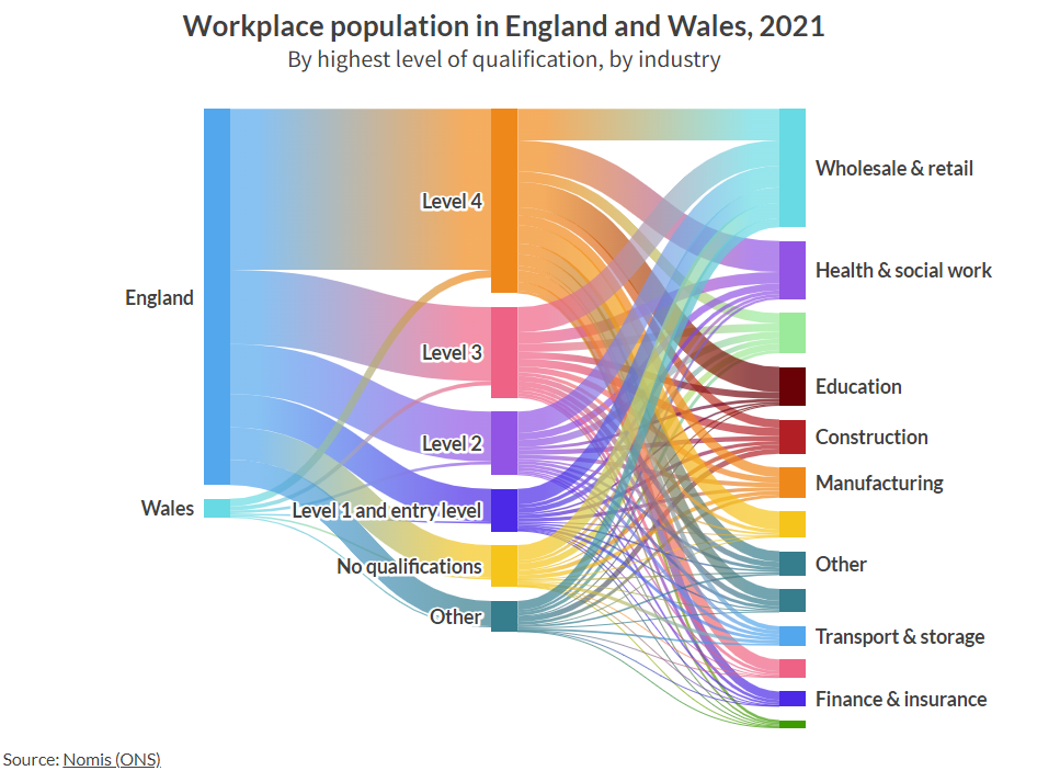
Source: flourish.studio
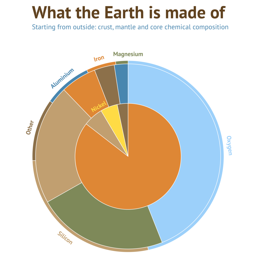
Source: datylon
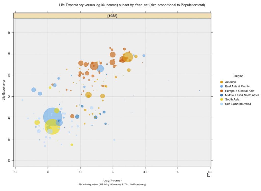
Source: iNZight
Canva and Infogram are two popular tools for creating visually appealing graphics. They offer pre-designed templates and a user-friendly drag-and-drop interface, making it easy to create professional-looking visualisations. However, their capabilities for complex data visualisation are limited. While these tools are suitable for basic and straightforward data visualisation needs, they may not be the best option for in-depth and complex data analysis and customisation. Both platforms prioritise design and aesthetics over data accuracy and are not equipped to handle large datasets. As a result, they may not be suitable for data analysts or scientists but rather for marketing and design teams, educators, and small businesses looking for attractive and easy-to-use visual communication tools. Despite these drawbacks, Canva and Infogram have some powerful features that make them popular among users. They have intuitive interfaces, support importing data from CSV, XLSX, Google Sheets, and JSON files and exporting in PNG, JPEG, and PDF, and allow for collaboration and embedding of high-resolution graphs on websites. Additionally, they offer a wide range of chart types, including traditional charts like bar and line graphs, as well as more unique options like funnel, pyramid pictorial, radial bar charts and treemaps. Some advanced features, such as animations and interactive maps, are only available with a paid subscription. Therefore, pricing should be taken into consideration.
Nota bene: ethics and accessibility in data visualisation
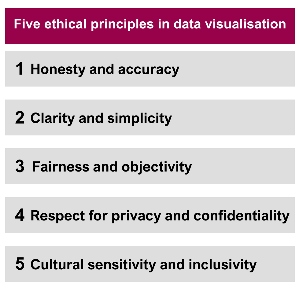
Ethics plays a vital role in the data visualisation of the research funded by the EU. The researchers are obliged to ensure that their data visualisations are accurate and unbiased. These projects often have a global reach, and as such, cultural sensitivity and inclusivity become paramount in data presentation. It is essential to consider the cultural context and diversity of the audiences when presenting data to avoid any cultural bias or exclusion. In addition, the EU has strict regulations on data privacy and protection, such as the General Data Protection Regulation. This means that researchers must also adhere to ethical standards when collecting, processing, and presenting data to ensure the privacy and confidentiality of individuals or groups. It is important for researchers in EU-funded projects to be aware of the ethical guidelines and regulations set by the EU, such as the Responsible Research and Innovation principles.
In the context of EU-funded projects, accessibility becomes even more critical. As these projects aim to generate knowledge and provide solutions for the betterment of society, it is essential to ensure that this information is accessible to all individuals, including those with disabilities. This includes making the visualisations screen-reader-friendly for individuals with visual impairments and providing alternative text descriptions for charts and graphs. Another critical factor to consider is colour contrast. There is a great variety of online tools available for checking colour contrast, such as Colour Contrast Checker. Moreover, the use of different shapes and patterns can also aid in making data visualisations more accessible for individuals who are colour-blind or visually impaired. The portal for European data provides different materials on the topic of accessible data, including a workshop on accessibility in data visualisation.
A trusted communication and dissemination partner in your project
In today’s data-driven world, data visualisation has become a crucial instrument for researchers. At accelopment, we recognise its importance and use powerful strategies and tools to effectively communicate research findings to different audiences. Being involved in numerous projects and leading EU project management, communication and dissemination, we deal with data visualisation daily – from infographics in communication materials like posters, factsheets and social media posts to our customised project management tool accelCOCKPIT®. As a trusted communication and dissemination partner in multiple EU-funded projects, we assist researchers in translating complex data into clear and concise messages to boost the impact of their project’s research.
If you would like to explore how we can assist your project in the communication, dissemination, and exploitation of your project, please feel free to reach out to us.